Dev Log · Websites, Design, Logo
New again: the site as a workshop
On 24 August the site took on the colours of the logo. A month later it is new again.
Why again
Sometimes you simply grow tired of something. And sometimes you notice after a short while, just by looking at it, that it does not suit you, without being able to say why straight away. The August version was well built, but it could have stood on any site: identical tiles, identical frames, three key figures in a row.
The new rule: every shape needs a reason from the site's own world. From the logo, from Rudolstadt, from the nineties or from the workshop.
What is there now
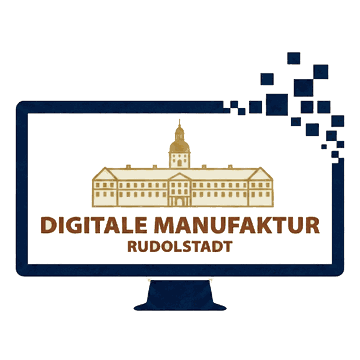
- The logo as the stage. The monitor from the logo carries the headline on its screen, with a brass type plate below giving year built, titles, downloads and rating.
- A cabinet instead of tiles. Anpfiff1 stands as a green and white game box, the icon in the centre circle. The five apps are floppy disks with written labels. Brass label holders hang on the shelves.
- The workbench. Whatever is not finished yet stands on a joiner's bench. Name and status are on a note pinned to the front.
- Post from the workshop. Every piece of news is an envelope: a Rudolstadt postmark with the date top left, the app icon as the stamp top right, an Update or Release stamp at the bottom. The 98 news pages are whole letters with a greeting at the end.
- The numbers add up. The home page used to name four, five and six published titles in three places. Now it says the same everywhere: six finished, five in progress.
What did not make it
The news section had more drafts than anything else: a teletext page, a ledger with columns, an exercise book, old handmade paper, notices in porcelain, slate, shipping tags and brass, a market stall with a town crier, a shop window and shipping crates. The letter stayed. It carries the date, the sender and the occasion by itself, and it suits a workshop where one person works.
A logo that only existed as a picture
The redesign exposed a gap: the logo only existed as an image of 360 and 1080 pixels. The SVG version on hand was a rough trace, and the castle frayed when shown large. So the logo was measured and rebuilt:
- Frame and pixel trail on the logo's own grid, 360 by 360 units, 17 pixel blocks with whole-number sizes.
- The Heidecksburg drawn by hand, every line and each of the 50 windows in its measured place. Laid on top of each other, the drawing matches the original, down to the one window more on the right than on the left.
- The typeface determined by comparison: 44 weights from 31 families set to the same height and width. Open Sans ExtraBold needs only 0.013 units of extra spacing to match the width in the logo. That is the typeface, set as it comes.
Logo, castle, typeface and a construction sheet with every measurement and colour are now kept as a brand kit. The logo can be reproduced exactly at any time, for print, press or the next site.
Like the site itself, the redesign was built with AI tools. Which drafts stayed was decided by looking at them.
Warm regards from the workshopDigitale Manufaktur Rudolstadt